
Text by Holly Seng
We’re starting off the new year inspired by the latest swoon-worthy shades forecasted to dominate design in 2024. The tastemakers of color have spoken, and this year’s roundup includes a spectrum of dreamy blues among moodier tones and delightful peach and honeyed hues that lend themselves to an airier aesthetic. If picking up a paintbrush seems like too much work, don’t worry! Below, we’re sharing our favorite looks—as seen in our Southern Cottage special issue—inspired by our current color crushes. And while some style ideas involve a fresh coat of paint, others show that even incorporating a small accent can totally transform a space.
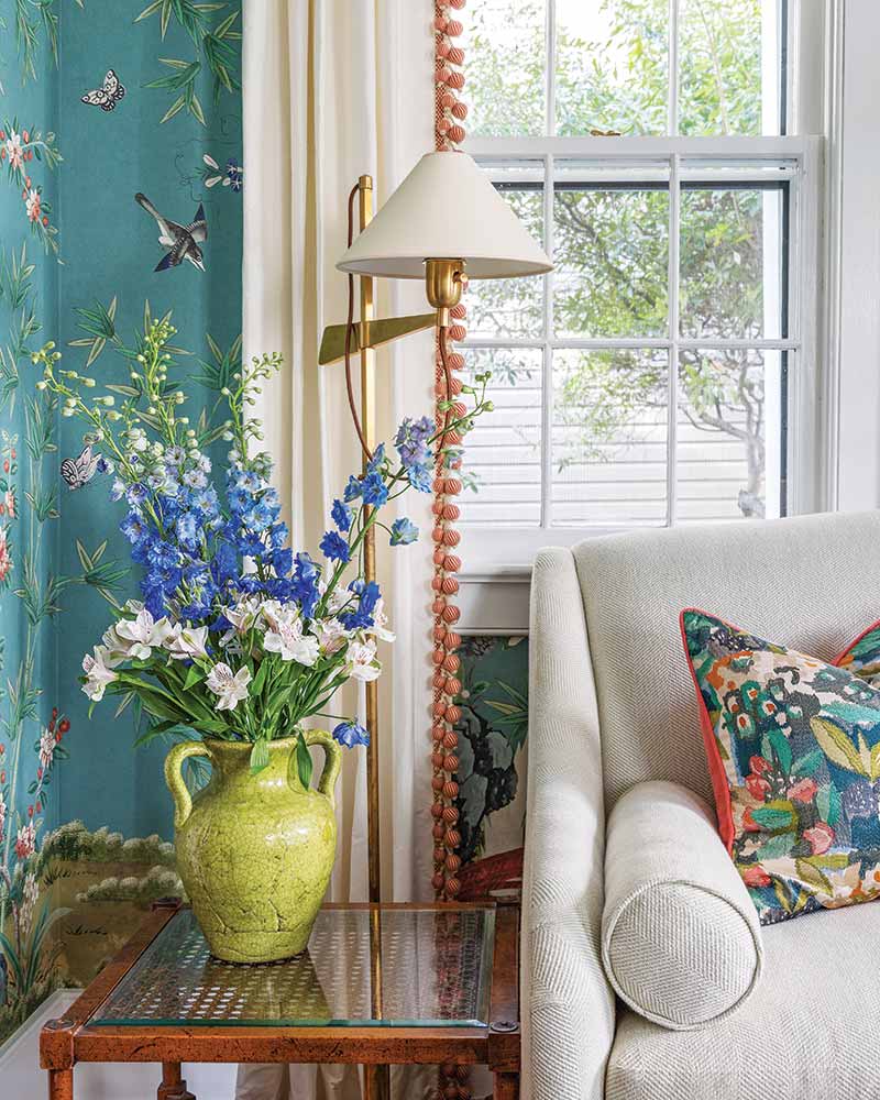
Benjamin Moore–Blue Nova

A blend of two captivating cool hues, Benjamin Moore’s Blue Nova offers both regal sophistication and timeless elegance.
“This alluring mid-tone features an enchanting duality, capturing the spotlight with endlessly classic appeal.”
—Benjamin Moore
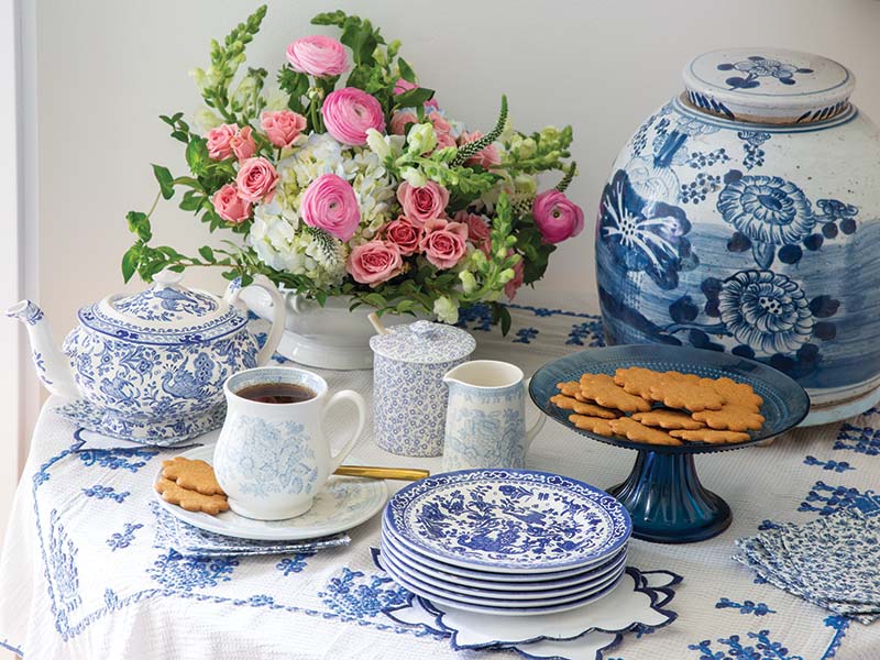
Style Tip #1: Dishware and linens are an easy way to bring colorful charm to your cottage without a full redesign. Plus, the collectibles serve a dual purpose in both their form and function and can be enjoyed whether they grace the table or are featured front and center in a china cabinet.
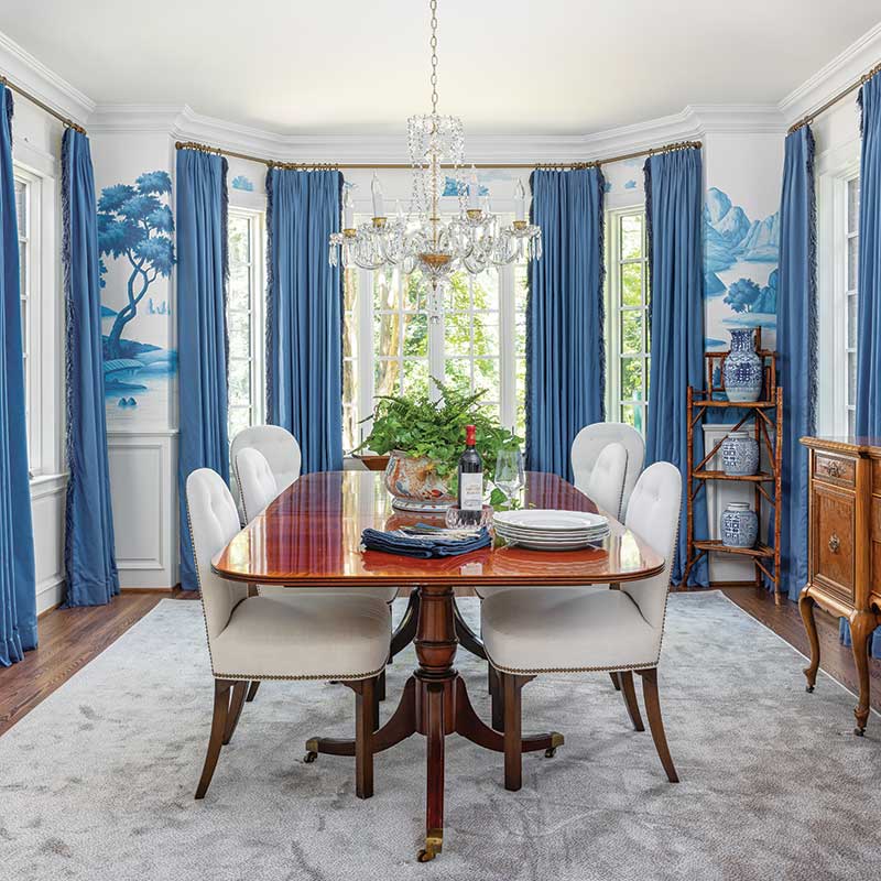
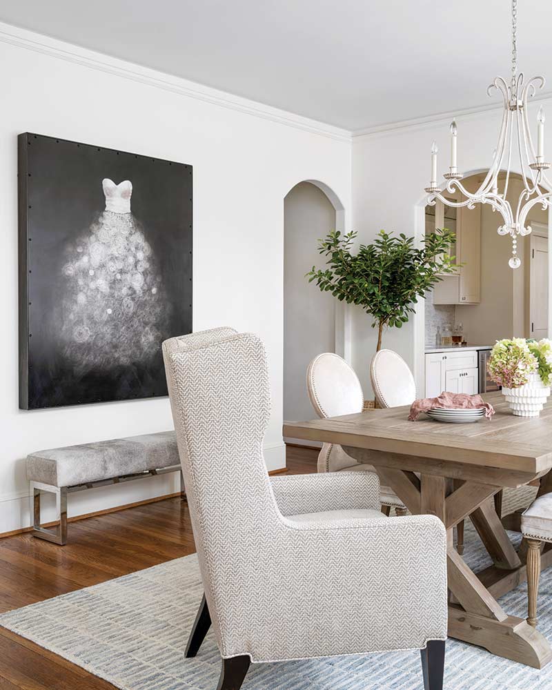
Style Tip #2: Fabrics lend texture as they elevate a space, and window treatments draw the eye upward, making a notable statement. In this dining room, the hand-painted mural is enhanced by draperies in a corresponding shade.
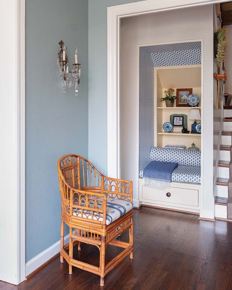
Style Tip #3: Never underestimate the power of an artful alcove. Nestled by the stairs, this lovely nook is outfitted with wallpaper matching the upholstered seat and bolster pillow. A comfortable throw plays up the violet undertones of the featured blue hue.
Pantone–Peach Fuzz
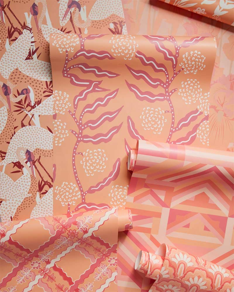

Pantone’s Peach Fuzz conveys both gentle warmth and a playful personality that’s perfect for livening up its surroundings.
“A shade that resonates with compassion, offers a tactile embrace, and effortlessly bridges the youthful with the timeless.”
—Leatrice Eiseman, Executive Director, Pantone Color Institute™
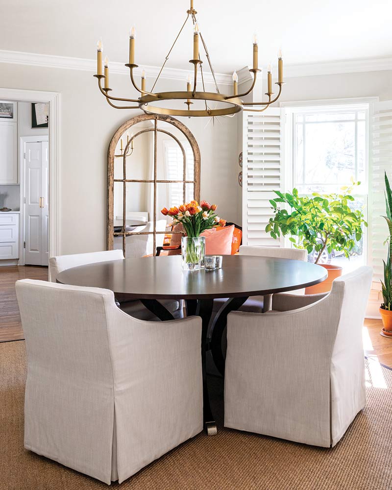
Style Tip #4: Subtle but effective, try out your newfound love for a color by starting with small accessories, such as a pillow or floral arrangement that don’t require a long-term commitment.
Style Tip #5: A fun, and often overlooked, way to give your space a personal panache: drapery trim—like the peachy pink shade found in this living room.
Behr–Cracked Pepper
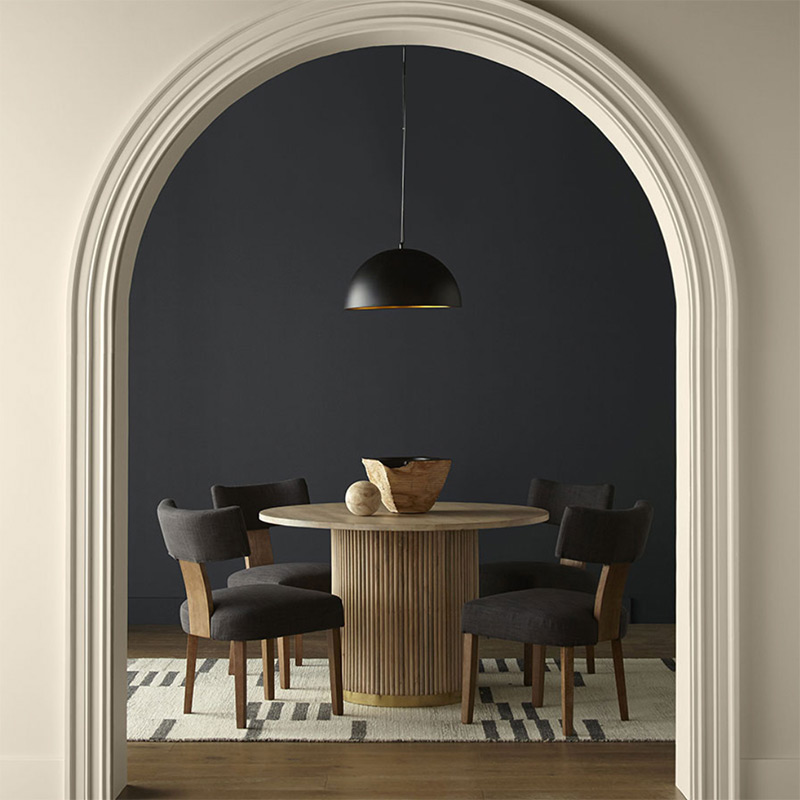

Bold, yet not overpowering, Behr’s Cracked Pepper packs a punch without stealing the show.
“A versatile soft black that accentuates the spaces you create life moments in.”
—Behr

Style Tip #6: If moody hues are too much for your walls, consider incorporating light fixtures with a darker finish. Not only does it add contrast to a mostly white space, it also pairs well with metallics for a glamorous finishing touch.
Style Tip #7: Artwork is essential to achieving that completed feel of a design. Find pieces that give prominence to your color of choice for maximum impact.
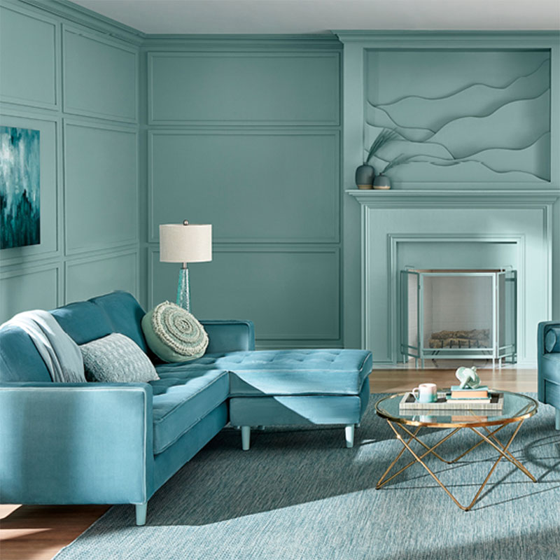
Sherwin-Williams–Upward

Reminiscent of a relaxing cloudless day, Upward by Sherwin-Williams offers a fresh spin on sky blue.
“A sunny-day shade for spaces brimming with positive energy, creative thinking, and total contentment.”
—Sherwin-Williams
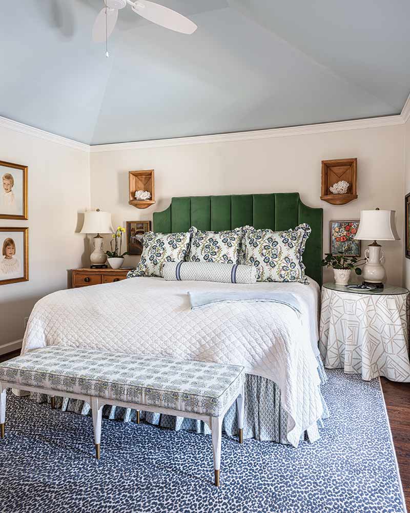
Style Tip #8: Dreamy shades, such as this one, are ideal for painting the ceiling of a bedroom—taking tranquility to new heights.
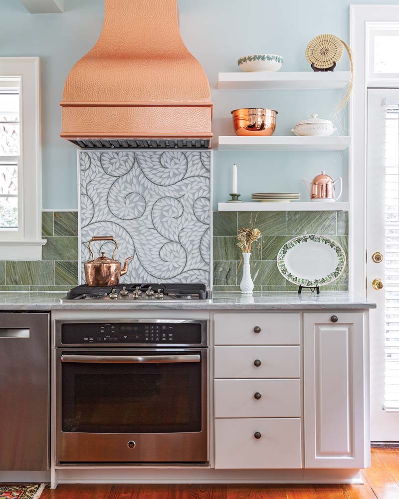
Style Tip #9: Create a focal moment in your kitchen with a colorful tile backsplash. Here, an ivy-inspired mosaic design imparts a dash of whimsy.
Valspar–Renew Blue

Green undertones play up the calming natural scheme that exudes from Valspar’s Renew Blue.
“A nourishing, green-influenced blue that creates a sense of peace wherever you place it.”
—Valspar
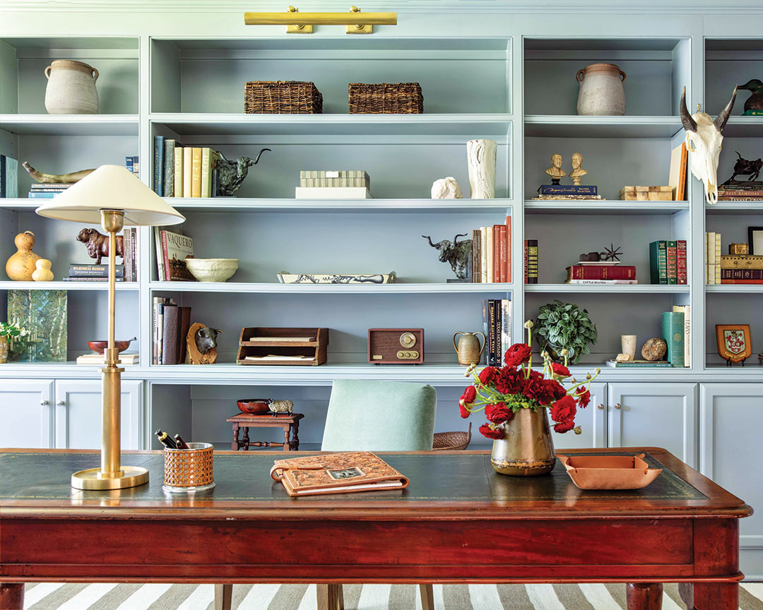
Style Tip #10: Create a showstopping office space with the ultimate backdrop by painting your built-ins a spellbinding shade. Consider the accessories that will adorn your shelves and opt for a color that’ll help them stand out.
Style Tip #11: Prints and patterns—from pillows to upholstered furnishings—introduce a featured color along with its supporting hues, setting a scheme for the remainder of the room.
Glidden–Limitless
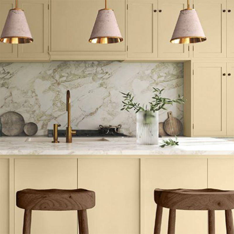
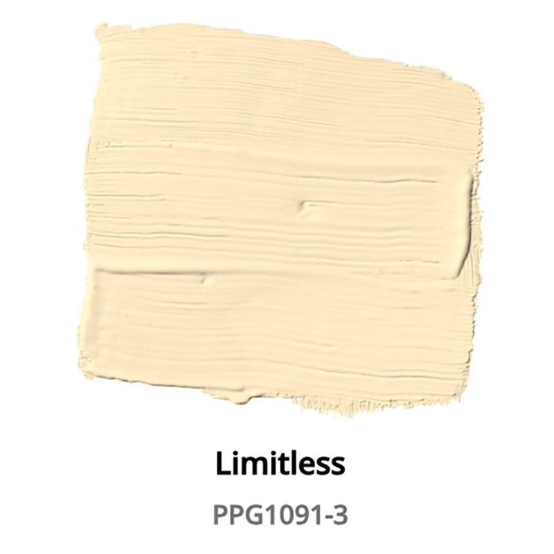
A cheerful, sunny hue, Glidden’s Limitless will brighten both your day and home.
“A fresh, warm hue that contains both the power of a primary color and the essence of a neutral.”
—Glidden
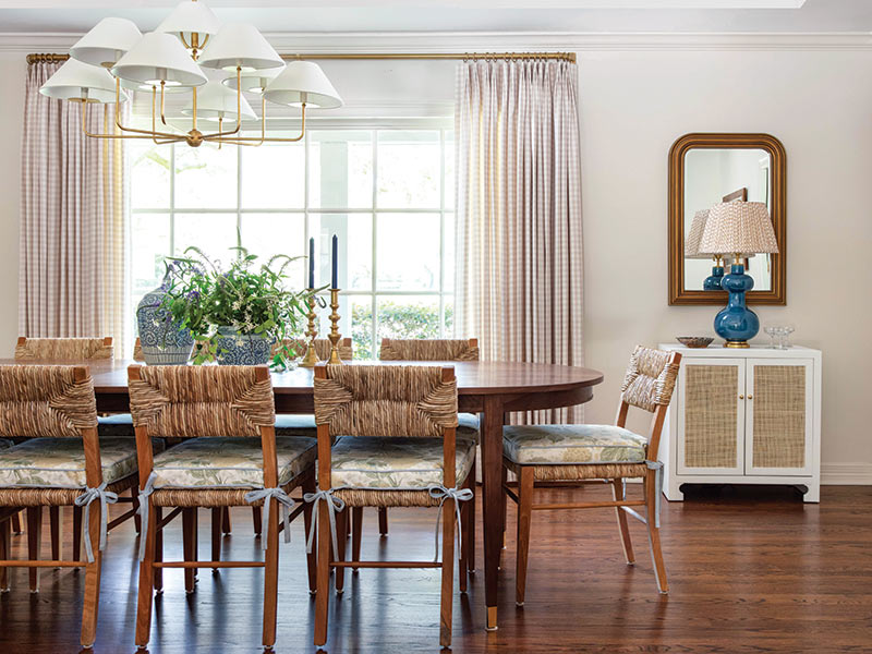
Style Tip #12: Woven accessories are all the rage, and we can’t help but be drawn to those that feature a honeyed hue. Pair these natural textures with soft fabrics that draw out their yellow undertones.
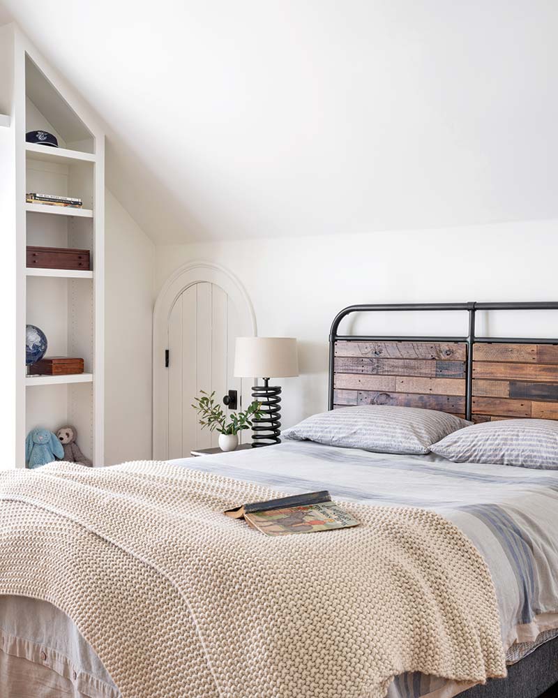
Style Tip #13: Highlight a shade’s neutral qualities by pairing it with gray accents. A cozy knit throw warms up the foot of this bed and adds a hint of yellow to an otherwise color-free space.


