

Photography by Jay Sinclair
A North Carolina designer blends an easy, breezy palette with plenty of patterns to create a well-curated home where luxury feels livable.
From as far back as she can recall, Kathryn Dixon remembers hearing her mother and grandmother teach the old adage “less is more.” “Editing is so important,” explains Kathryn, a sought-after interior designer based in Charlotte, North Carolina. “Don’t just fill up your home. Choose things that are sentimental or beautiful, and never stop editing.”

It was this penchant for simple and serene that guided the house hunt for Kathryn and her husband, Tom, as they moved their young family from California to North Carolina in August 2010. It only took three months for Kathryn to infuse her impeccable style, and soon the transformation revealed a polished palette anchored by treasured pieces, such as furniture and accessories passed down in their family or acquired from decades of travel.

The family’s dining room is designed around sentimental antiques. A 19th-century French buffet was purchased at an auction during a Vermont vacation, while the table is a handcrafted heirloom gifted to Kathryn by her aunt. A monochromatic white and chocolate brown palette makes entertaining easy. “You have tons of flexibility with this color scheme, as you can add flowers and bold table settings as you need.” A geometric wallpaper in the dining room rounds out the space, blending old and new in a fresh way.
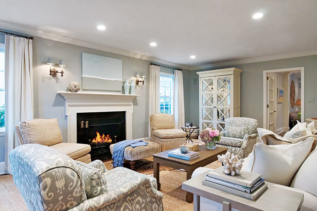
Elsewhere in the home, nature’s colors and textures—stone, sky, sand, and water— became the basis of design. “I like color, and I like pattern,” Kathryn says. “Typically I choose one or the other. If you limit your colors, you have more opportunity to use pattern, and likewise.” In the living room, for instance, chairs covered in gray ikat and camel zebra print are complemented by the textural interest of the ottoman upholstered in a velvet cheetah fabric and a room-sized sea grass rug. In the corner of the room, a large cabinet’s mirrored doors help expand the well-used space.
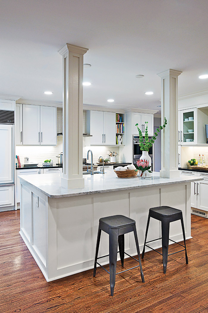
In the kitchen, most of the renovation was cosmetic. Professional appliances, high-quality cabinetry, and granite countertops were already in place, so Kathryn focused on paint (choosing a not-too-creamy, not-too-cold white), a fresh backsplash, and contemporary pulls. For the fully redesigned island—a popular gathering spot for the kids to watch Dad cook—Kathryn selected Carrara marble and added a second column to balance one that hides a structural support.

Upstairs, what used to be a dark-cherry sky-lit library became a bright, cheery sitting room off the master bedroom. “It feels much like a little hideaway,” says Kathryn. She chose a well-curated selection of items for the open shelves—some sentimental, such as her wedding invitation and her children’s artwork; some functional, like a jewelry box and tray; and some simply fun, including favorite vases and shells. “In my work, I’m exposed to so many new furnishings and fabrics daily,” Kathryn says. “But when it comes to my home, it’s not about trends. It’s about choosing items with meaning. It’s about finding what strikes a chord with our family.”