
Text by Hannah Jones
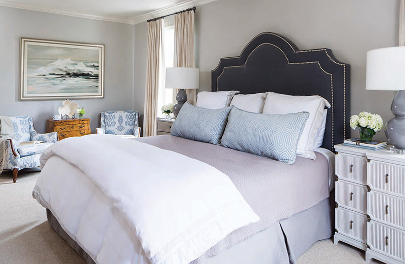
Though Kelli Fleming is a lover of color, her master bedroom is a serene contrast—and a much-needed one—to her life. Mother to two and partner at a law firm, she leads an active lifestyle, and she and her husband both craved a retreat. “I thought it was important to have something a little more serene and inviting for winding down at the end of the day,” Kelli says.


Together with designer Marianne Strong, the Flemings created a serene oasis washed in a blend of gray, cream, white, and blue. “I really believe that master bedrooms should be a place of rest and refuge,” Marianne says. “To achieve this, we stuck to a soothing color palette and soft, classic textures.” But this blending of the color wheel didn’t come naturally to Kelli. “I am very much a matchy-matchy person,” she admits. “Marianne has had to convince me over the years that white, gray, and cream are all ‘friends’ and can all be placed into one room and look great.” To give her a pop of color, Marianne introduced blue into the room with the addition of throw pillows and recovered chairs.

When designing the gallery wall, designer Marianne Strong tried to fill the space without imposing too much on the room with overwhelming features. “We found the console first, with the plan to do a gallery wall above it,” she says. “The intaglios were the perfect addition—both in color and texture.” The table in between the two armchairs was a gift from Kelli’s mother after the passing of her infant son, William. “In the process of grieving his loss, my mother took me to Atlanta to hunt for the perfect piece for our house in which I could place William’s special mementos,” she says. “We found this chest, and I immediately knew it was just what we needed.”

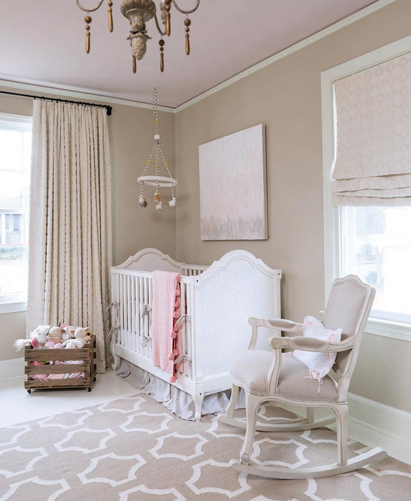
The Flemings carried the soft, neutral theme into their daughter’s nursery, where much of the color is found in the accent pieces. The room is a calming beige hue with painted white hardwood floors. Kelli wanted her favorite color—pink—to make an appearance, though, so she made the practical choice to paint the ceiling, in case they needed to switch it in the future for other children.

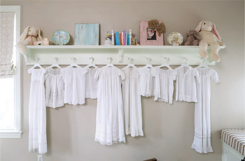
When designing the nursery, Marianne blended elegance with sentiment by displaying heirloom christening gowns. Kelli wanted to be sure that a Kaylea Hill painting was added to the room in honor of her infant son who passed away. “After my son was born and passed away, the sweetest group of women at my office gave me a little blue painting by Kaylea Hill, which you can see sitting on the shelf,” she says. “When I found out I was pregnant with my daughter, I just knew that she also needed a painting by Kaylea Hill in her nursery.”

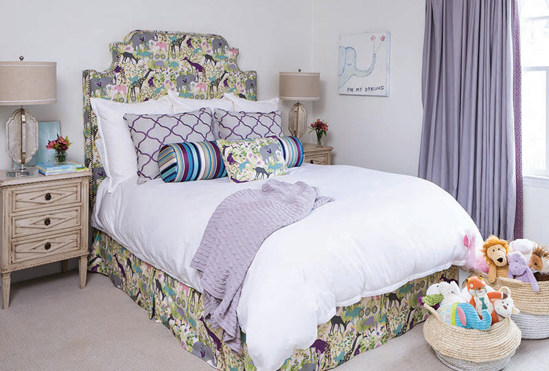
While the master bedroom and nursery are calming spaces, Kelli added lively color and prints to her oldest daughter’s room. Moving her from the serene nursery, the Flemings knew that they wanted their daughter’s room to be more colorful. They’d previously made a crib skirt in an animal print fabric, so they continued with that fabric as their inspiration. As for her color choice, Kelli attributes the decision to her daughter, stating, “My daughter looks so cute in the color purple!”
Though most of the bedrooms pushed Kelli out of her colorful comfort zone, the result was the soothing space she and her husband wanted and needed. “I knew I wanted something soft and calming but not boring,” Kelli says. “The color palette and mix of patterns has achieved just what I was going for.”