
Text by Holly Seng
We’ve spent these first few weeks of the new year captivated by color—from a classic Tennessee farmhouse filled with blue hues to a midcentury cottage decked in vintage vibrant style and eye-catching exteriors that contrast their snowy surroundings. Part I of our color trends series focuses on fresh ways to incorporate the colors of the year into your home. In addition to announcing their standout shade, a few paint companies have released their trending palettes, and so part II of our series highlights hues that pair well together. Decorating with a palette in mind—whether it’s light and airy or moody and saturated—ensures every element works together seamlessly while weaving in contrast for a design that lends both comfort and visual interest.
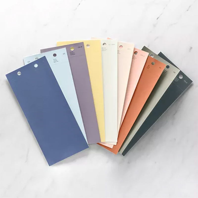
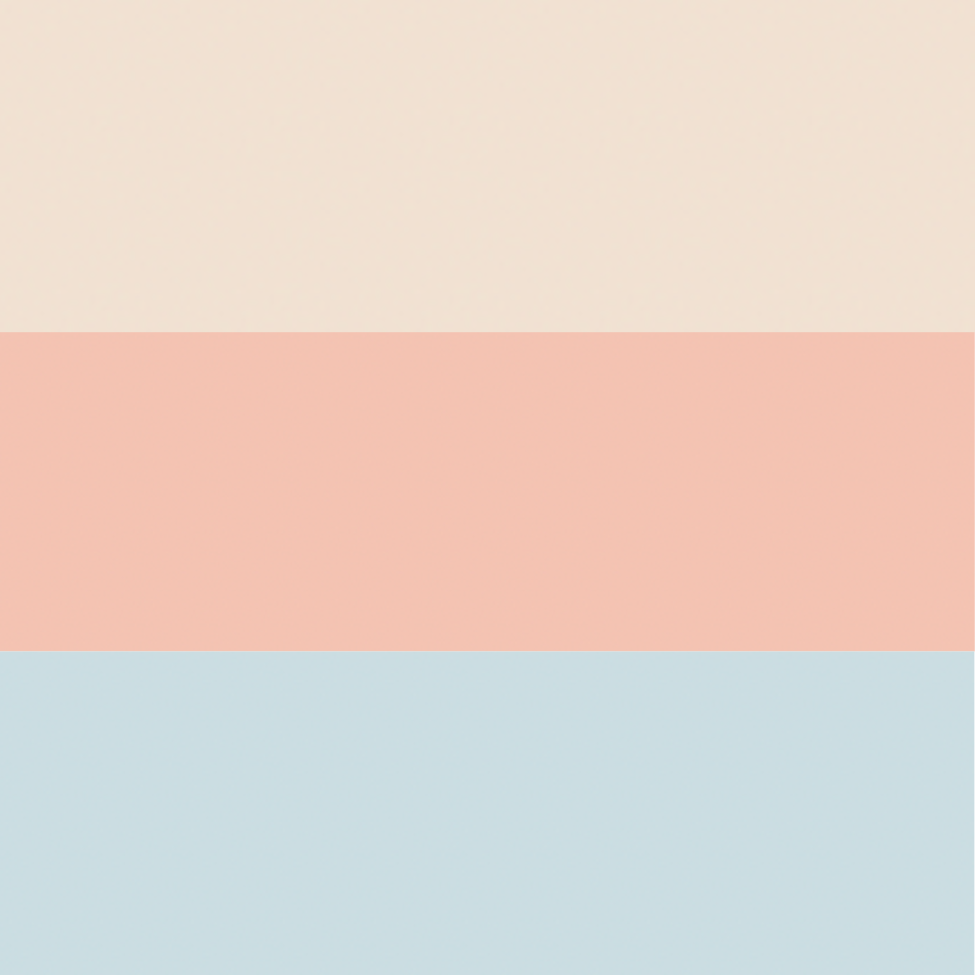
Benjamin Moore’s Color Trends 2024 Palette offers a “softly saturated” and “nuanced approach to contrast” as it draws inspiration from travels and creative possibilities. This delightful collection spanning creamy white to green with a hint of gray, offers endless versatility. We’re sharing a few of our favorite spaces from our new Spring issue with designs that demonstrate the lasting impact of a thoughtful palette and style ideas for bringing these colors together—from wallpaper and rugs to florals and accents.
Classically Chic
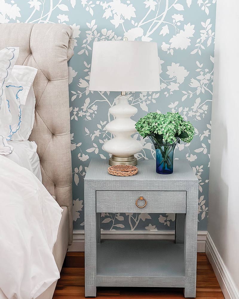
 Blue—no matter it’s shade—is always a match for a white, whether it be a crisp, bright white or creamier blend. This bedroom features a striking statement wall covered in an ice blue floral wallpaper. Scalloped embroidery along the edge of the pillowcase coordinates with a nearby vase, introducing a deeper blue to the scene.
Plaid & Posies
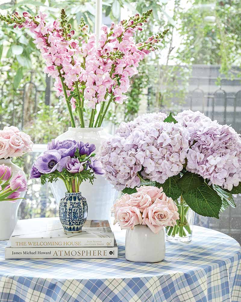
 From table linens to florals, there are so many simple ways to freshen up your cottage with a new scheme that doesn’t involve a long-term commitment. Equal parts warm and cool, purple blooms are the perfect bridge between serene blues and sweet pinks.
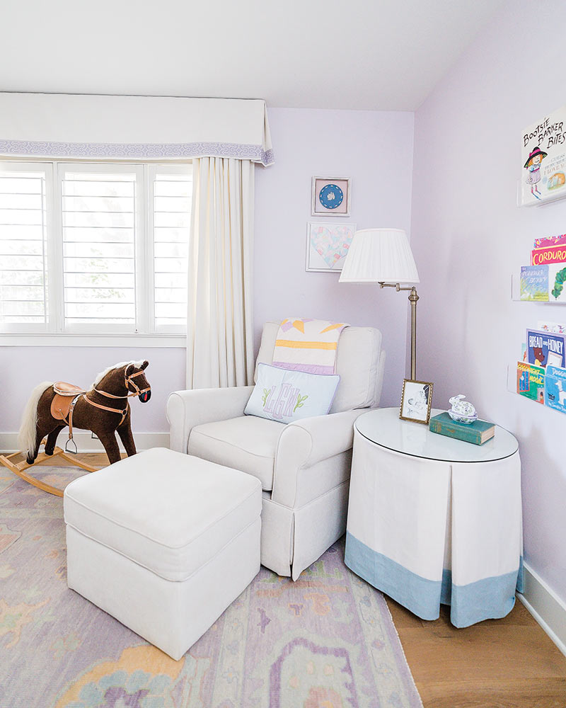
Mix Things Up
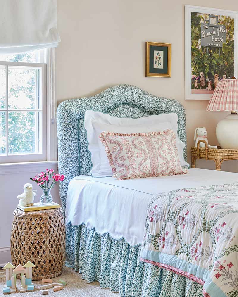
 A little girl’s room is the ideal place to take a fanciful approach to a light and airy palette by mixing patterns and prints. The key to pulling it off is allowing for space that gives the eye rest—like the white coverlet and pillow—and selecting colors that work for and not against one another.
Artful Touch
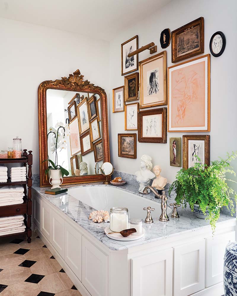
 While gallery walls can be challenging, there’s no better way to show off your collections and customize your home. From the artwork itself to the matting, frames, and backdrop, even what seems like the smallest of decisions can help achieve maximum impact.
Underfoot
 When drawing inspiration for your palette, don’t overlook the importance of a rug. Homeowner Bridget Green, founder of online Oushak rug retailer Milagro Collective, designed this one specifically with her daughter’s nursery in mind.
Patterned Pillows
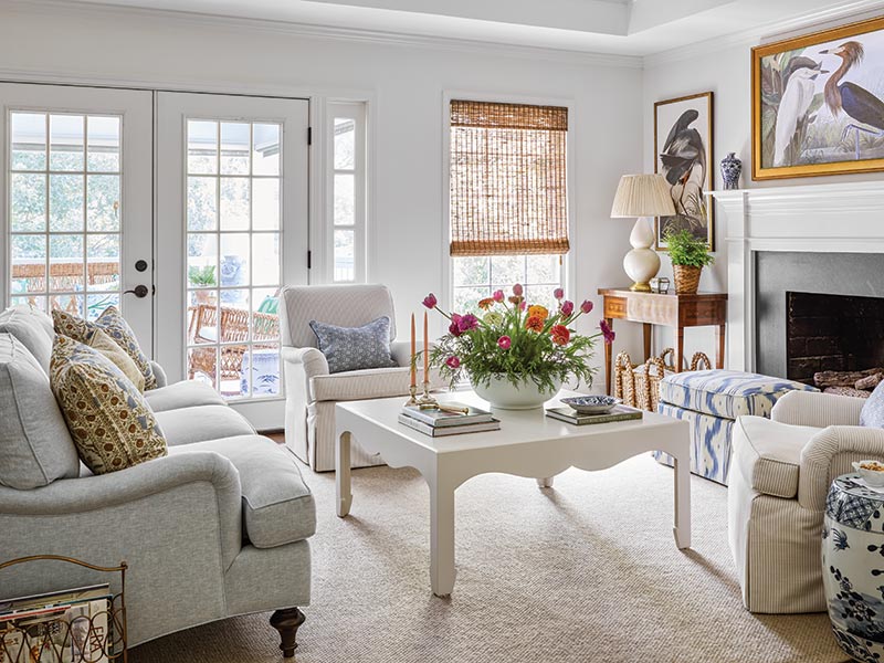
 Neutral furnishings let the accessories do the talking and few things add a powerful panache quite like patterned pillows. Here, interior designer and homeowner Bailey Ward incorporated a favorite print, Lee Jofa’s Sameera, that adds a rich warmth to the room.
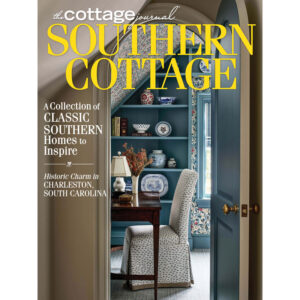
Pick up a copy of our Spring issue to see more!


